What I like about these front covers are that they don't use too many colours, but are extremely effective as the text, editing and photos are great. Also on some of these the overall simplicity makes them very effective;
"Considering the circumstances of Jonathan's Absence, his ideas have the potential to give him a high grade since the editting he will be doing is hard to master. I like his ideas because as I said, they are hard to use but the end result would be something that looks professional and great. If this was my work my next stage would be using stylish text to make the poster seem more professional as it wasn't mentioned in Jonathan's ideas. Regards, Stephen :)"
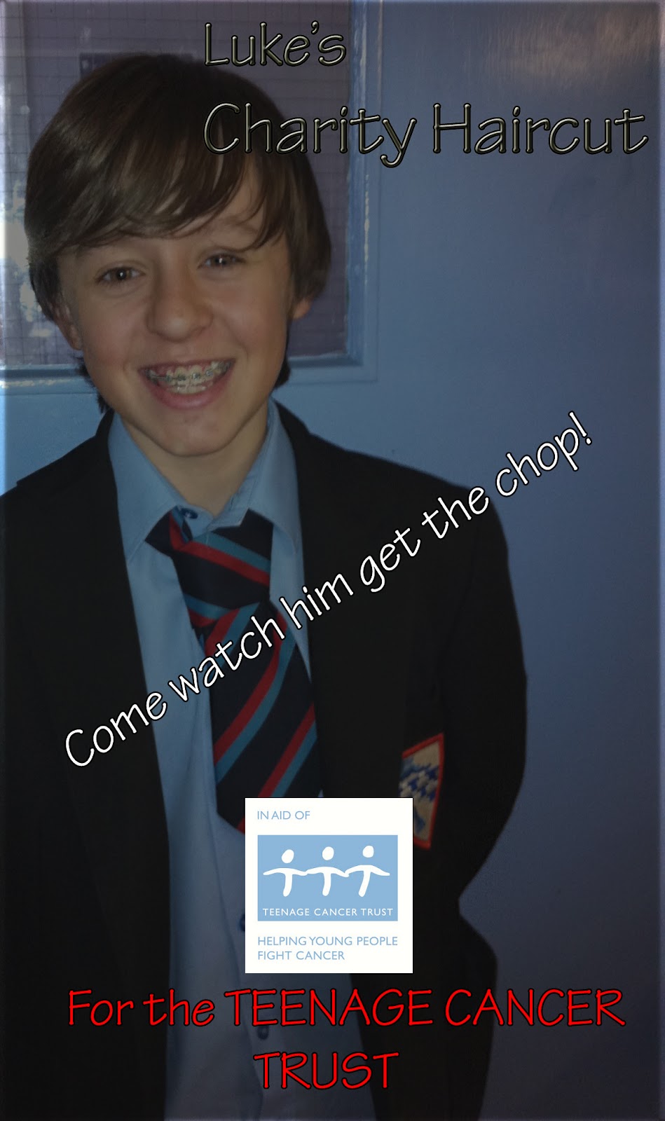
Today, we edited an image to make a poster in photoshop. I have decided the next thing I may do on my music magazine is use effects which I have not used to make my magazine look more professional, for example the 'Spot Healing Tool" and the 'Clone Tool'. This will make my magazine look more professional as using these tools will enhnace images on my magazine for sure.